Web Development
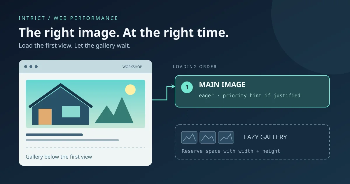
Images on your SME website: what should load first and what can wait?
A practical guide to hero images, lazy loading, fetchpriority and reserved image space, without empty speed promises.
Lees meerWhen should you use a popover, dialog or ordinary text? A practical guide to clear, accessible interactions on your SME website.
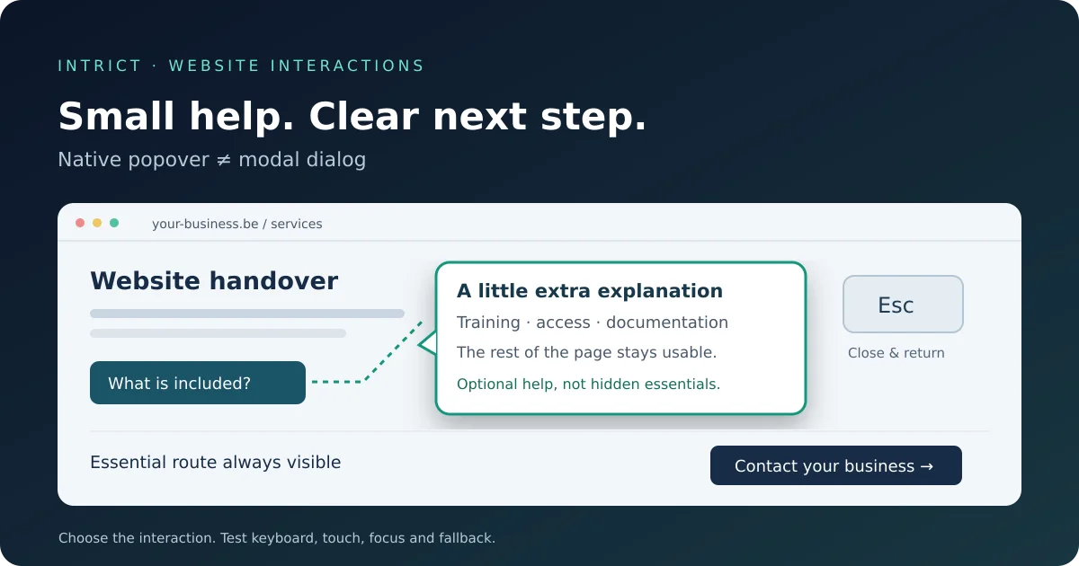
Summary: A small panel with helpful information does not always need a JavaScript library. The native Popover API lets the browser handle part of the opening and closing behaviour. For an SME website, the important decision is choosing the right interaction: optional explanations can stay lightweight, while essential information and forms must remain reliably accessible.
A visitor is looking at your services and wants to know what “handover” includes. You could create another page, display the explanation directly, or open a small panel from a button. The latter is often called a popover: additional content above the page that does not interrupt the entire navigation flow.
For Belgian freelancers and SMEs, this can be useful for a technical term, a short product explanation or help beside an enquiry form. The objective is not adding movement to your website. It is reducing uncertainty at the right moment. An unclear button that opens an unpredictable panel does the opposite.
This is a practical evergreen guide to existing browser functionality, not an announcement of a new feature released today.
The HTML popover attribute turns an element into a popover. A button with popovertarget can open and close that element. A simple example does not require custom JavaScript to program this basic interaction.
With the default popover="auto" variant, visitors can also close the panel by clicking outside it or using a dismissal mechanism such as Escape. The browser displays the open panel in the top layer. This prevents it from simply being clipped by an ancestor element's overflow settings.
That removes some custom logic, but not all design work. You still need to decide where the panel appears, how it fits a narrow screen, what the button says and how its content is read. Native functionality is a starting point, not an accessibility certificate.
A popover is non-modal: the rest of the page generally remains available for interaction. That suits optional information someone chooses to open. It is not a reason to build a mandatory choice or an entire enquiry journey without further consideration.
A modal HTML dialog, opened with showModal(), makes the rest of the page inert. Visitors cannot interact with the background in the same way. This distinction matters for a confirmation or a longer task that temporarily requires their attention.
Do not choose a modal panel just because it looks professional. A separate contact page or a visible form can be simpler and more robust. For a short frequently asked question, an ordinary expandable text section may already be sufficient.
Start with an actual visitor question. Consider a small explanation beside “included maintenance”, rather than a pop-up that interrupts everyone on arrival. Keep essential commercial information on the page: what you offer, who it is for and how to contact you.
A popover may be a good candidate when the content is short, supplementary and does not force an action. Long terms, detailed pricing information or an enquiry form deserve a separate assessment of whether a normal page or carefully designed dialog is more appropriate.
Do not expect a guaranteed conversion increase or SEO benefit. Less custom code may simplify maintenance, but a poorly designed native panel is still poorly designed. The benefit should be demonstrated through a clear, working visitor journey.
MDN documents the HTML attribute and its variants. A web.dev article from February 2025 also corrects an earlier Baseline announcement: an issue with clicking outside a popover to close it on iOS and iPadOS made the earlier assessment too optimistic.
The lesson for a business owner is straightforward: “supported” does not mean every customer's device behaves identically. Ask your developer to check the specific feature and the browsers your visitors use. Newer variants or additional positioning techniques may have different support from the basic feature.
Do not make important information depend entirely on a panel that may behave differently in older browsers. Keep a normal contact link available, for example, and provide a usable fallback for supplementary text. The appropriate fallback depends on the implementation; adding an attribute alone does not prove it exists.
Assess this on the actual website, not just in an isolated demo. Font sizes, fixed headers and existing overlays can affect the experience. Do not submit a real enquiry on the public website simply to test a panel.
Not necessarily. A developer can assess whether an existing component is suitable for native popover behaviour. Your website structure and target browsers determine the work involved. A browser feature alone is not a reason to rebuild everything.
No. The basic opening and closing interaction can be declared in HTML, but your site may still use JavaScript for data, validation and other interactions. Evaluate which logic each component actually needs.
No. The browser handles part of the behaviour, but labels, content, keyboard experience, focus and screen reader testing still matter. Choosing between ordinary text, a popover and a dialog is also part of accessible design.
It may be technically possible, but that does not make it the best choice. For a longer form, available space, error messages, focus and reliable access are decisive. Keep a normal contact route available and test the complete journey.
Want to find out whether the small interactions on your website help visitors or get in their way? Discuss your website with IntrICT. Start with one concrete journey, such as explaining your services or reaching your contact form. Choose the simplest solution that also works well on mobile and with a keyboard.

Web Developer & Digital Strategist — IntrICT, Gent
Gespecialiseerd in moderne websites (Next.js, React), SEO en GEO voor Belgische bedrijven. LinkedIn
Meer interessante artikelen die je mogelijk interessant vindt
A practical guide to hero images, lazy loading, fetchpriority and reserved image space, without empty speed promises.
Lees meer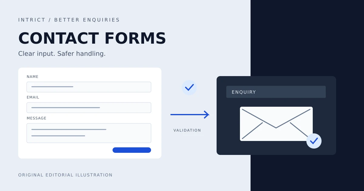
Practical contact forms for Belgian SMEs: less data, accessible labels and errors, server checks and an honest acknowledgement of receipt.
Lees meer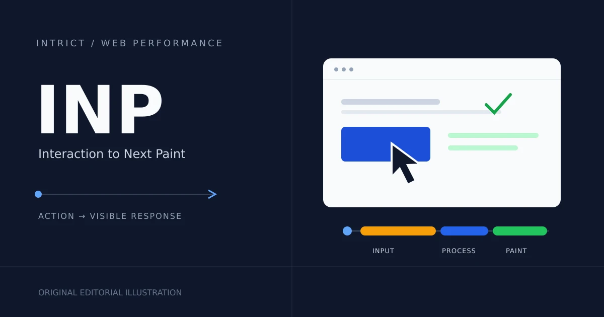
A website can load quickly yet respond slowly. Learn what INP measures and how to improve responsiveness for your small-business website.
Lees meer